After researching and analysing several different college magazine covers, I decided to produce the idea of having a magazine based on a fresh start and decided to make the magazine the first issue in order to create the sense of continuity with the idea of a fresh start and a new fresh magazine.
Upon analysing college magazine covers, I came to notice several different conventions in which each one included. The masthead was big, bold, colourful ad stood out from the page which was also accompanied by a main image which was generally of a student. The image always related to the main cover line which is the case with every magazine so I decided to carry on the idea of doing this as it only made sense. Other cover lines that were found on the front covers where sometimes accompanied by small animations or small images which I believed was a good way of introducing colour and excitement into the front cover.
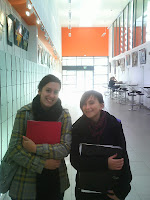
Taking my idea into consideration, I produced a plan on Microsoft publisher in order to create a vague idea of the layout of my front cover. After this, I went on to take several pictures which I then narrowed down to just three in which I thought gave the impression of a new start to the audience best.
After narrowing down my pictures to just these three, I then went on to choose the picture in which there is only one student stood in front of the college building. I decided to use this particular image as I felt it was more capable of putting across the idea of a new, happy and fresh start. If I was to retake the pictures, one particular aspect I would change would be the fact that there are no other people in the background. I believe if the image had other students in the background all sat talking, it would give of the impression of the college being a sociable and happy place whereas in the image used the college looks empty.
After selecting the image I went on to alter the lighting and vibrancy of the colours by using a picture editing website called ‘Picnik’. On this website after altering the image, I then went on to add the text onto the front cover which made it feel more like a magazine before I had finished it. I then uploaded the front cover onto paint which is where I went on to add the barcode as well as the information bar across the bottom.
The target audience I aimed for was new students that had just started the college. I believe I achieved this due to the image used as well as the choice of headlines and colours which all major factors of creating a teenage magazine that looked interesting to read as well as giving off a happy impression.
The target audience I aimed for was new students that had just started the college. I believe I achieved this due to the image used as well as the choice of headlines and colours which all major factors of creating a teenage magazine that looked interesting to read as well as giving off a happy impression.


No comments:
Post a Comment